Case Study: Water for Injection Plant AI-based Maintenance
This article presents the results of applying artificial intelligence (AI), such as machine learning algorithms, to identifying and predicting anomalies for corrective maintenance in a water for injection (WFI) processing plant. The aim is to avoid the yearly stoppage of the water for injection plant for preventive maintenance activities, common in the industry, and use a more scientific approach for the time between stoppages, expected to be longer after the study and thus saving money and increasing productivity.
The case study describes how we preprocessed data from sensors, alarms, and water quality attributes indicators for 2018 and built predictive models based on identified “anomalies” during this period. Next, we preprocessed the same data captured for the first six months of 2020 and applied the 2018 models to see if they were still valid two years on. The initial results show the models are robust and are able to identify the chosen anomaly events. Also, the rule induction machine learning approach (a technique that creates “if-else-then”-type rules from a set of input variables and an output variable) is “white box,” which means the models are easily readable by humans and can be deployed in any programming language. Data volumes of around 4 GB per year, generated from 31 sensors, 14 alarms, and four water quality indicators, were successfully processed.
The WFI Plant
Figure 1 shows the general schema of the WFI plant, consisting of four main zones (1 to 4). The pretreatment system is located in Zone 1; the WFI manufacturing by distillation via thermocompressor is in Zone 2; Zone 3 contains the hot water for injection loop (at 85oC) plus 10,000 liter tank; and Zone 4 contains the ambient temperature water for injection loop (manufacturing loop). In Zone 3, there is a 10,000 liter WFI tank, which is maintained at 85°C, and the main loop, which runs at 85°C, has three points of use. One of these points delivers WFI to the manufacturing loop with 12 use points, which are cooled down to ambient temperature to be used by operators.
The IT infrastructure includes automatic control by programmable logic controller (PLC), human machine interface (HMI) panel for starting/stopping and changing set up values in the system, and system of control and data acquisition (SCADA) for data of critical values storage under electronic record rules (CFR 21 part 11). Critical values include loops temperatures, total organic carbon (TOC), conductivity, pressures, and flows. The system has been running for more than five years.
The following critical variables and alarms in the plant sensors have been recorded for the different circuit loops every 30 seconds for more than four years:
- 85°C loop: conductivity, TOC, loop return temperature, temperature downstream of the heat exchanger, temperature in the 10,000 liter tank, flow in the return, pressure downstream of the pump, temperature in the outlet of the distiller, and conductivity in the distiller
- Ambient loop: conductivity, TOC, loop return temperature, temperature downstream of the heat exchanger, temperature in the vent line, temperature in the vent filter, flow in the return of the ambient loop, and pressure downstream of the pump
Each variable has been stored as follows: 2 values per minute x 1.440 min per day x 365 days per year x 4 years = 4.204.800 values per variable + metadata stored in comma separated value (CSV) format under CFR 21 part 11 requirements.
The sampling frequency is every 30 seconds because this is the default value needed to supervise parameters like temperature, conductivity, and TOC. After statistical evaluation, it was found that one minute was too long and 15 seconds was too short. Temperature, conductivity, and TOC variations are not expected within a range of 30 seconds.
In the unlikely event that a use point is added or removed in the WFI system, the conductivity, TOC, or temperature in the loop would not be expected to change. Such a change would have a high cost for stoppage and validation.

The files were acquired in CSV format for data scrubbing with 26,453 files between 2016 and 2020, representing 115 million parameters values together with 10,000 alarm messages, occupying a total volume of 22 GB.
Two alarm types are used: type 1 alarms stop the system such that the user cannot extract WFI from the use point. All use points are automatic and in case of any type 1 alarm, the use point does not open. All other alarms, type 2 alarms, are informative.
Cleaning and consolidating of this information with a personal computer was found to be unfeasible, so a big data hardware and software infrastructure (on-premise) was used:
- Distributed data processing
- High performance computing (HPC)
The CSV files were automatically exported from the original database to meet CFR 21 part 11 requirements for authorization, authentication, and electronic record management. Any modification in any CSV file can be detected by a special application in the system that detects any file modification that has been created. If a sensor “goes bad,” an alarm type 1 or 2 is raised.
Information that refers to network working notifications, network speed, and internal data used by the programmers but not related to date, time, or value was removed as part of cleaning and consolidation of the data files.
Note that we adopt a more practical definition of big data, which reflects the real situation when doing data processing: if the data cannot be processed in conventional hardware (e.g., laptop/desktop computer) and software (e.g., Excel), then it is big data. For example, Excel in 64-bit Windows and 16 GB RAM stops running for files more than around 500 MB. Both the length (number of rows) and the width (number of columns) can be a determinant: for example, a file with 7,000 rows and 12,000 columns will be very difficult to process with conventional hardware and software.
AI Approaches
In a previous project by Rodriguez et al.,1 neural networks (unsupervised learning system autoencoder) were applied to the 2018 data of the WFI processing plant to identify outlier anomalies in the sensor data. Stored data were used to feed the autoencoder, and outliers were considered as values out of range or affected by some kind of electrical interference. For example, a temperature that cools down 50ºC in 10 seconds or a temperature of 150ºC, are not possible (our heat exchanger has a limit of 135ºC).
This study confirmed the viability of applying machine learning algorithms to identify underlying trends and thresholds in the water plant sensor da-ta. In our project, we adopted a methodological approach2 and took into account the time series data type by deriving statistical metrics for specific time windows.3 This approach has previously been successful for predicting rice blast disease from a complex array of meteorology sensors.3 We also used our experience in applied research in the process industry4 to solve data processing and modeling issues for sensor data. In contrast to our previous work using neural networks,1 we chose rule induction5, 6 as the machine learning algorithm, which was shown to be equally precise while providing human readable rules as the data model, which then can be easily deployed. The large data volumes were processed using Python and the scikit-learn machine learning library using online resources. In the scikit-learn library, we have mainly used preprocessing, tree, and linear model libraries for big data processing, preparation, and modeling. In addition, we used the Matplotlib library for data visualization and the DateTime library for working with time fields columns.
The machine learning approach uses a “tree/rule induction” algorithm,6 which generates a decision list for regression problems using a “separate-and-conquer” approach. In each iteration, it builds a model tree and makes the “best” leaf into a rule. Its reported performance makes it one of the best state-of-the-art algorithms for rule induction where the output (predictive/classifier) variable is of numerical continual type.
A key part of the algorithm is the “information gain measure,” 7 based on Shannon’s definition of “information entropy.”8 In order to partition the training data set, the heuristic uses an information gain calculation to evaluate which attribute to incorporate next, and where to incorporate it in the induction tree.
Big Data Processing
Big data volumes of around 4 GB per year, generated from 31 sensors, 14 alarms, and 4 water quality indicators, were successfully processed. The data was preprocessed using cloud services and Python analytics.
Data Preparation
Initially, the entire 2018 data was loaded into the Python data frame and the date/timestamp was converted into a Python date/time data type and separated as “date” and “time.” After cleaning, the data consists of the 31 sensor data values recorded with 30-second time intervals between subsequent records. The cleaned data frame structure contained repetition of the timestamp as the sensor values were distributed in a row fashion. Reorienting the data frame to contain unique values was done by creating a new column for every sensor to facilitate further processing of each individual sensor and knowing its effect on the underlying trends in the data. This process is called “pivoting.” The pivoted data frame structure was used for both 2018 and 2020 data. Once the sensor data was prepared, the alarm data was also treated in the same way. However, the alarm data distribution over time was stochastic (involve probability) and these were therefore matched to the closest 30-second timestamp.
On one hand, we wanted to test the latest data (2020); on the other hand, we wanted to use data to train the models that had a more significant time difference (2018) to evaluate if there was any significant change over time in the sensor calibrations. The one year of data (2018) was considered sufficient to train the models in this current evaluation, thus 2019 data was not used.
The 2018 data preprocessing time was benchmarked by identifying specific sub-steps, and the following provides the details of the time taken for each data preparation process sub-step. Most of the initial steps such as loading the entire sensor data and conversion and selection operations have linear time complexity O(n), as the data size is directly proportional to the processing time required by the operations. However, for pivoting and merging the alarm data based on nearest timestamp, the original complexity was O(n2). Applying optimization techniques such as divide and conquer, especially in the merging of alarm data with sensor data, yielded a final complexity of O(nlogn). The total number of records in all steps except the last was 1 million, which corresponds to 4 GB of data. The last step processed 365 records, one for each day of the year.
Approach
First, corrective maintenance events (or situations/problems) were initially identified with the water plant experts for the year 2018. Complementary data (over the same time period, e.g., one reading per day) was obtained for the system quality indicator (e.g., WFI, required pharmacopoeia parameters). Next, non-supervised techniques, such as k-means and DBSCAN, were used for unsupervised clustering. Note that DBSCAN is a clustering algorithm that defines clusters as continuous regions of high density. It works well if all the clusters are dense enough and well separated by low-density regions. The overall objective was to build an “anticipatory model” for which the machine learning algorithm is able to identify trends in the data in the run-up period (e.g., 14 days) to a corrective (or preventive) maintenance event or a given situation requiring attention and thus predict the event/situation.
Following on from the analysis and modeling of the 2018 data, in a next step we apply the models trained with the 2018 data on the 2020 data (1/1 to 30/6). For each day, the mean and standard deviation of sensor readings were calculated, followed by the 3- and 7-day moving averages, and the water quality alarm (conductivity) was aggregated. In the analysis step, we generated plots and statistics of the sensors to compare 2018 values with 2020. This was followed by a clustering of the 2020 data using DBSCAN, k-means, and density-based algorithms, to identify clusters of anomalies and nonanomalies in 2020. These statistics help us to validate the anomalies identified by the predictive models. Finally, the 2018 models were applied to the 2020 data to identify anomaly periods.
Data Analysis
The data analysis step prepares the basis for the data modeling that follows. Visualization of the sensor and alarm data over time via plots was a key technique used to understand the physical variables and alarms and identify outliers. This was combined with correlation analysis and clustering techniques. For example, key correlations were found between sensors AIT15_70B (return TOC in the ambient loop) and AIT15_16B (return conductivity in the ambient loop); TT15_15B (temperature cold return loop) and AIT15_16B, TT15_15B (return 85°C loop temperature); and TT15_77B (temperature in the ambient loop) and TT15_15B. A consensus approach applied to different density-based clusters (2–6 clusters) indicated the following potential “anomaly” groups: Feb. 14–24, Mar. 5–22, Mar. 24–Apr. 15, Apr. 18–27, May 6–9, May 26–30, Jun. 6–8. Note that in order to select the optimum number of clusters for a given data set, the clustering algorithm has a metric to indicate “goodness” of the clustering (low intra-cluster distance and high inter-cluster distance), together with the data analyst and domain expert evaluations to be sure the groupings make sense in terms of the data analysis objectives.
A 3D study was made of the normal cases and the anomaly cases, using three axes representing the temperature and water conductivity sensors TE15_77B (temperature in the ambient loop), AIT15_70B (return TOC in the ambient loop), and AIT15_16B (return conductivity in the ambient loop). From the study it was clear that these three sensors were able to distinguish normal cases from anomalies.
Predictive Modeling
The following describes how the data models were trained and tested on the 2018 data. Then we describe the results of applying these models to the 2020 data.
Building Data Models
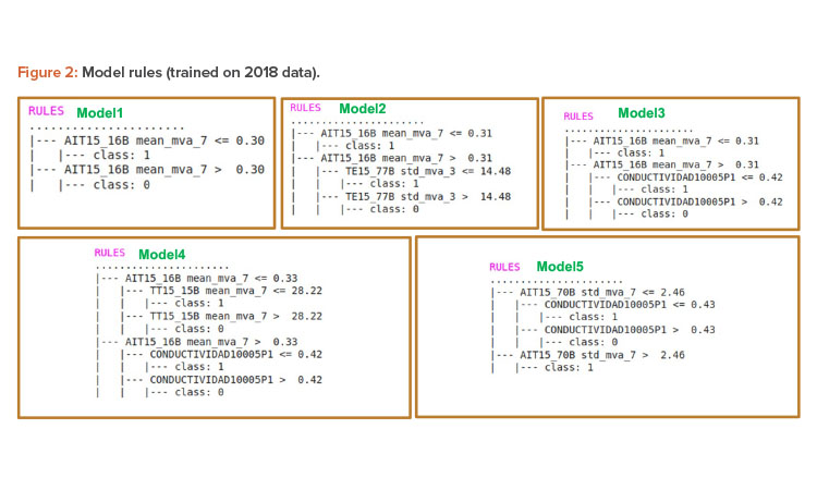
As mentioned above, different rule models were generated from the 2018 data. Figure 2 shows the rule models trained from the 2018 data. From the rules, it can be seen that the main sensors included are AIT15_16B (return conductivity in the ambient loop), TE15_77B (temperature in the ambient loop), AIT15_70B (return TOC in the ambient loop), and Conductividad1005P1 (conductivity water quality attribute measure of the sampled WFI in one point of use). Note that the 7-day moving average (mva_7) was preferentially chosen among the available attributes (which also included the 3-day moving average, the mean, and the standard deviation).
An example for interpreting the rule model for model 5 interprets the first branch as follows:
IF AIT15_70B_std_mva_7 IS less than or equal to 2.46 AND Conductividad1005P1 IS less than or equal to 0.43 THEN class = 1 (anomaly).
With reference to the data normalization overall, it can be seen that the models maintain the same structure and attributes, which in some cases had switched between models. These rule models are generated after doing a preselection of the 2018 data. This preselection considered the most relevant events (4 nonanomaly days and 5 anomaly days) of the 2018 data where the 14 days before a relevant day had a direct impact on deciding if the day contained an anomaly or not. Each 14-day period was considered as a “data group,” with corresponding start and end data and a label if considered an anomaly (1) or not (0). For example, data group 1 had start/end dates of 1/1 and 14/1 and a label of 0 (no anomaly), while data group 6 had start/end dates of 26/4 and 9/5 and a label of 1 (anomaly).
It is relevant to note here that the anomalies are related to sensors, which are in turn related to alerts. The alerts have a ranking system of criticality (1 to 4, where 1 is the most critical). From this, the anomalies can be ranked and ordered on the DSS screen so the operator can clearly see the most critical ones and discretionally discard the least critical ones. The anomalies chosen for train/test were major anomalies (level 1) that caused shutdown of the plant/zone.
After consulting with the WFI plant maintenance records, the anomaly/nonanomaly events were associated with the following dates: May 10, Aug. 15, Sept. 10, Oct. 19, and Dec. 3.
The anomalies have a confidential aspect so we can only give limited details. The ones corresponding to 2018 were in the months of May (repair of sealings and re-calibration), September (TOC error/repair and pump replacement), and October (filter replacement and review tasks). The anomalies identified and used for training/testing of the models were associated with major alarms, requiring shutdown of part or all of the plant.
Nine data groups of 14 days were chosen in chronological order for training and testing. Then several data groups were chosen for training a model and one data group was chosen for testing the model. For example, model 1 was trained with data groups 2, 1, 3, and 5 and tested with data group 6. Two key aspects were that the test data group had to be chronologically posterior to all the train data groups, and the train data groups had to include a mixture of anomalies and non-anomalies. From the available combinations throughout the year 2018, this enabled us to train and test five different models, shown previously in Figure 2.
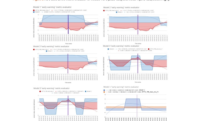
In order to evaluate the success of the predictions of the data models on the 2018 data, we have used the area under the curve (AUC) metric for the model trend curves. The AUC is a quantified value of the area under a given curve between two vertical points. A larger area can be interpreted as a more significant “signal” and a smaller area as a less significant “signal.” The AUC metric used in this study served as an “early warning” alert where the model was able to flag the previous 14-day period before an anomaly event. Using this alert, it is possible to spot the start of an anomaly period and advise the maintenance manager of the WFI pharmaceutical plant installation so they can take preventive measures.
Figure 3 (bottom right) shows the AUC plotted for model 1 (blue) and corresponding time period in the 2018 data where model 1 was applied to the May 10 anomaly. The red trend shows the main sensor values, in this case for AIT15_16B.
| May 10 | Aug. 15 | Sept. 10 | Oct. 19 | Dec. 3 | Average | |
|---|---|---|---|---|---|---|
| Model 1 | 13.44 (1.0) | 12.27 (1.0) | 12.27 (0.92) | 12.27 (0.75) | 6.87 (0.53) | (0.84) |
| Model 2 | 0.00 (0) | 0.00 (0) | 0.00 (0) | 5.08 (0.39) | (0.39) | |
| Model 3 | 13.28 (1.0) | 13.92 (0.85) | 10.98 (0.85) | (0.90) | ||
| Model 4 | 16.36 (1.0) | 12.88 (1.0) | (1.00) | |||
| Model 5 | -0.02 (0) | (0.00) |
Figure 3 (bottom right) shows for model 1 that the main sensor (present in the rules) is AIT15_16B and the value taken is the 7-day moving average of the mean (thus _mean_mva_7). The blue area represents the anomaly period identified by model 1. The AUC for model 1 is calculated with the following integration equation:
AUC=∫ba−1.46+0.541x−0.0351x2+5.89E−04x3.dx
In the equation, a and b are the x-axis range of April 26 to May 23, 2018. This period is translated into a numerical sequential index =1.28 (14 days before and after the start date of the anomaly) to be evaluated and placed in the evaluation of the curve equation above. An anomaly event threshold period has been noted for each model. For model 1, May 10 is considered as the anomaly event start date. Therefore, the numerical sequential index of =1.14 is used to calculate the AUC of the model’s output values for the period from April 26 to May 10, 2018, which gives a value (area) of 7.33 (see later baseline adjustment). This calculation was done after standardizing the model data values.
As mentioned previously, five anomaly start dates (May 10, Aug. 15, Sept. 10, Oct. 19, and Dec. 3) were identified from the statistical analysis and by verification of the WFI maintenance records for 2018. For each corresponding 28-day period, the AUCs for the polynomial curves of each model were fitted. The resulting values are in Table 1. Note that for the 2018 training data, models were only applied to dates that were posterior to the data they were trained on, thus avoiding including a priori information.
After the AUCs of the models were calculated, a “baseline” value is determined for each model. The baseline of the model (read from the y-axis) is a relative reference for the model’s performance in an ideal state where it is not detecting any anomaly. The integral of the standardized model value in its ideal state (y-axis value) for each model is considered its baseline. By aggregating the model baseline AUC with the overall AUC of the model, we can get the true capability of the model to detect an anomaly period.
Table 1 shows the AUC results of the models after aggregating the original AUC with the baseline AUC. For model 1, the calculated baseline AUC was -6.11 and the AUC of model 1 for the May 10 anomaly event was calculated as 7.33. After aggregating the baseline AUC value, we get 13.44 for model 1 and May 10. This calculation was performed for all the models and dates, giving the resulting AUC values.
Table 1 also shows the relative performance values in parentheses. To obtain a normalized relative performance between models and anomaly dates, the AUC values were normalized with respect to the greatest value per column (when there were at least two values in a column). For example, in column 5 (Dec. 3), model 4 had value of 1.00 because it was normalized as the maximum value in column 5 (12.88/12.88). Model 5 had a value of 0 because it was normalized as the minimum value in column 5 (-0.02/12.88). Finally, the average for each row of all columns is calculated and given in the last column. It can be seen that models 1, 3, and 4 were the best overall performers for the anomaly dates and model 2 and 5 obtained the lowest average values. For individual dates, model 4 can be seen to be the best performer for Oct. 19 and Dec. 3, model 1 is the best for May 10 and Aug. 15, and model 3 performed well for Sept. 10.
Model Testing on 2020 Data
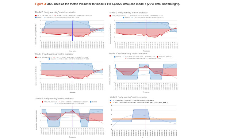
Here are the results of applying the 2018 models to the first six months of 2020 data. To evaluate the models on specific events, two “anomaly” periods were chosen: Feb. 16–18 and April 20–26. These periods were chosen because they coincided with real maintenance tasks that significantly affected the sensor data and were confirmed by checking the WFI plant maintenance records.
We evaluated the application of the models to each anomaly event, using the AUC metric described above.
As seen previously, Figure 3 shows the AUC plotted for each model and corresponding time period in the 2020 data. In Figure 3, models 1, 2, and 3 are applied to the Feb. 16–18 anomaly period and models 4 and 5 are applied to the April 20–26 anomaly period. The red colored trends show the main sensor values and the blue colored trends show the model values.
The anomalies have a confidential aspect so we can only give limited details. The ones corresponding to Feb. 14–17, 2020 refer to a major stoppage for repair: change of membranes of valves, probe calibration, and sterilization of circuits after calibration. The anomalies identified and used for training/testing of the models were associated with major alarms, requiring shutdown of part or all of the plant.
Note that the operator will not have to interpret the graphics of Figure 3 or the model of Figure 2 (which are internal to the system). The operator will just see a list of potential events ranked by criticality and probability.
| AUC models | Relative performance | Average | |||
|---|---|---|---|---|---|
| Feb. 16 | Apr. 20 | Feb. 16 | Apr. 20 | ||
| Model 1 | 29.63 | -0.07 | 1.00 | 0.00 | 0.50 |
| Model 2 | 27.47 | -0.02 | 0.93 | 0.00 | 0.46 |
| Model 3 | 28.89 | -0.02 | 0.98 | 0.00 | 0.49 |
| Model 4 | 11.85 | 33.29 | 0.40 | 1.00 | 0.70 |
| Model 5 | 16.93 | 31.34 | 0.57 | 0.94 | 0.76 |
The AUCs for the polynomial curves fitting the models 1, 2, and 3 to the first time period (Feb. 2 to Mar. 1) and anomaly start date (Feb. 16) are 22.61, 18.63, and 20.83, respectively. The AUC of the model’s output values helps us to understand how well the 2018 model works with the 2020 data. Also, considering models 4 and 5 for the second time period (Apr. 6–May 4) and anomaly start date (Apr. 20), the AUCs for the polynomial curves are 13.14 and 7.42, respectively. Table 2 also shows the AUC values of the models after aggregating the baseline AUC value. For example, the integral of the baseline AUC value for model 1 is -7.02 and aggregating this value with 22.61 gives the final AUC of 29.63 as seen in Table 2, column 1. This calculation is repeated for all the models, and their respective results are presented in Table 2.
The first column of results in Table 2 shows the AUCs for each model applied to the Feb. 16 anomaly. In general, a larger AUC will give a bigger “alarm” signal, so for the Feb. 16 anomaly, models 1 to 3 are giving the strongest “signals” (29.63, 27.47, and 28.89, respectively). Also, the second column of results shows the AUCs for each model applied to the Apr. 20 anomaly. This shows that models 4 and 5 give the strongest “signals” of 33.29 and 31.34, respectively.
The normalized relative performance between models and anomaly dates (Table 2, columns 3 and 4) was calculated as previously described for the 2018 results (Table 1). For individual dates, model 4 can be seen to be the best performer for Apr. 20 and model 1 for Feb. 16.
The results in Table 2 show the strength of “signal” that the models trained on the 2018 data provide for the anomaly periods identified in the 2020 data, and how they coincide with the anomalies.
For deployment, as we do not know beforehand which models will give the best performance for which dates, we must run all models and then can use a threshold τ to choose the ones to apply. The threshold would have to be calibrated from further testing, but if we initially set τ = 0.75, for example, it can be seen that for Feb. 16, models 1 to 3 would give output values greater than τ (and thus would trigger an alarm) and for Apr. 20, model 4 and 5 would give output values greater than τ and would thus trigger an alarm. But, if the maximum AUC value is not good (e.g., instead of 29.63 it was to be 8.3 for Feb. 16), then the relative threshold will not work. So we also need a value σ (a minimum AUC which has to be achieved), which is factored into the threshold to trigger the alarm. The value σ would have to be calibrated for the data.
Note that the human operator does not have to interpret the models (Figure 2) or the AUC (Figure 3), which are internal to the system. The operator will just see a list of potential events ranked by criticality and probability. There is a 14-day prediction window that was agreed on with the operations manager as practical for planning remedial actions.
Conclusions
We have presented an approach for condition-based maintenance in a WFI plant, using data driven modeling based on extensive sensor data. The predictive data models use a 14-day period as input and give as output an indication if an anomaly event will occur in the following 14-day period. Data models have been trained on data from the year 2018 and tested on data from the first six months of 2020. The AUC metric provides a realistic measure of the “signal” produced by a predictive model during the lead-up period to an anomaly, which can be used in deployment.
For the 2018 data, predictive models based on 14-day periods were able to predict events later in the year, thanks to patterns that existed in the 14-day lead-up periods that indicate that an anomaly will or will not occur. The corresponding rules can be interpreted as “nuggets’’ of information which could be used, for example, to give special maintenance attention to the sensors. For deployment, the data models could serve as a back end to a decision support front end.
For the 2020 data, some differences were detected in sensor values and behavior with respect to the 2018 data, so it was decided to standardize the data (between 0 and 1). Note that “normalization” typically means rescaling the values into a range of [0, 1], whereas standardization rescales data to have a mean of 0 and a standard deviation of 1 (unit variance).
This is a typical issue for deployment of data models: how AI using machine learning will improve and get “smarter” over time for decision making and data interpretation. A “quality metric” is necessary to periodically “benchmark” the data model against new data batches to quantify precision. If the precision goes below a given threshold (which is calibrated depending on the application), this triggers an alert. Based on the alert, offline retraining with new (latest) data samples can be performed, or automatic online retraining can be performed. The former is recommended at present because the model should be verified by a human expert before going online, for example, to evaluate potential issues such as noise/data quality and bias, among others.
Overall, the current approach is promising and follows a systematic methodology for data processing, analysis, and modeling with specific time series features built into the data. The AUC metric is proposed as a key metric for measuring the “signal” produced by the predictive models. It could be said that the approach is limited given that it is not designed to predict events in an unseen period further than 14 days in the future. On the other hand, the approach has a wide scope as it identifies any anomaly and not specific faults (for example, by zones of the plant or for specific components). Preventive maintenance requires flexibility by its nature so the current work will serve as a basis for the predictive time window and identify specific key components that can most affect the production and downtime of the WFI plant.
For now, the data produced in the process is only used for informational purposes. In the next phase, we will be able to take action and perform maintenance based on the AI information. The second phase will also consider validation of the algorithms to confirm if they should be the basis for GxP decisions. Evaluation of return on investment (ROI) for implementing the approach will also be considered in the next phase.
For the WFI plant in general, we are on the way to having an application that will allow us to decide when preventive maintenance is needed based on the likelihood of anomalies rather than on a set annual schedule.
About the Authors


